Film Trailer Feedback
Social Media Feedback- One way in which we were able to get feedback from our audience is through the means of Instagram. Instagram was a good way to get feedback on our trailer as it has over 800 millions users which means we could get a wide range of audience feedback.
Above shows some of the comments we received on our Instagram post. Overall, we were pleased with the comments that had been made as they were honest with both positive and negative comments being given.
Verbal Feedback- We received a lot of verbal feedback on our film trailer from many different people, some of which include friends, family teachers and class mates. I made a note of this verbal feedback given on the notes app on my phone. This is so we did not forget the changes and improvements we needed to make. Below shows some of the verbal feedback we received.
Positive
- Good range of shots
- Good use of camera angles
- Story line fits in well with the genre
- Good start to editing
- Need to include more video effects
- Improve sound
- Re order shots around to create a more chaotic feel
- Faster paced editing needed at the end to build up the tension
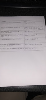
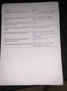
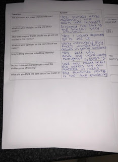
Questionnaire Feedback- Myself, Abbie and Niall created a short questionnaire about our thriller film trailer which we got friends and class mates to fill out. We told the group of people filling out our questionnaires to leave them anonymous. This is so we could receive truthful feedback as we thought if people put their names on the questionnaires they might hesitate to give negative feedback as we would know who gave it. We received a wide range of feedback which is seen in the images below.


Changes- We decided to make some changes as result of the audience feedback that we received to try and make our film as good as it could possibly be. Some changes include...
- Lighting- A common convention in thriller films is low key lighting as it creates a sense of fear in the audience. We therefore tried to incorporate it constantly throughout our trailer. However, it was hard to use this element of mise en scene throughout the whole trailer. This is because some of them were so dark they were unclear to the audience. For example, the shots of Detective Marshall trying to solve the case were too dark. At first we thought that we would have to re film all of these shots with better lighting however, we managed to find a tool on Adobe Photoshop which lifted the lighting slightly, making the image clearer. The image below shows one of the shots of Detective Marshall after we changed the lighting.
- Effects- Many effects appear throughout thriller film trailers to help create a sense of mystery. One criticism we received a few times was that there was not enough effects in our trailer. In our first draft we included effects such as black and white and rewind. We then added in slow motion and the blur effect which appear in the thriller film trailer, Before I Go To Sleep.
Like our film trailer, I had a lot of feedback on my film poster too. This helped me a lot during the making of my poster as it allowed me to make the changes and improvements needed to.
Positive Feedback
- Good image manipulation
- Good use of colour
- Effective background
Negative Feedback
- The top of the poster looked too empty
- Images could be bigger
Changes
This is what the top of my film poster was like before I changed it. My teachers and class mates all had the same view that the top looked too sparse and could do with re arranging. I definitely agreed with these comments once they had been made and made some slight changes. Below shows the adjustments I made.
This image is how I changed the top of my film poster to improve it. I added in quotes from well known newspapers and magazines to make our film appeal to the audience. I also moved the title, tag line and Daily Mail rating to the centre of the poster to make it stand out even more.
- Another change I made was making the image of Stacey larger. This is because a piece of negative feedback I received was that the images were slightly too small. I decided to make the image of Stacey bigger and leave the mage of Zac as it was. This is because Stacey is the protagonist so it makes sense for her image to be larger than Zac's. I also decided to reduce the opacity of Zac's image. This means that his image is slightly more see through. I did this because Zac is murdered in our trailer so only appeared in the very start, so therefore I thought it made sense that his image was smaller and more transparent than Stacey's.
Final Film Poster
Film Magazine Front Cover
Most of the feedback I received about my magazine front cover was positive so I only had to make marginal changes to it when I received the negative feedback.
Positive Feedback
- Good colour scheme
- Good layout
- Liked the 'Free poster inside'- entices the reader to buy it
Negative Feedback
- Looks too much like a fashion magazine- needs a cover line
Changes
- My teachers and peers believed that my magazine cover looked a little bit like a fashion magazine cover, which is not the look I was going for. I made changes to the top of my magazine cover to ensure that it looked like a film magazine cover. My first step was moving the magazine name, 'Rating', down. This automatically helped take away from the fashion magazine feel. However, it then looked too empty so I decided to add a cover line which made the whole thing come together as a film magazine front cover.
Final Film Magazine Front Cover


No comments:
Post a Comment