Rebecca's A2 Blog
Wednesday, 2 May 2018
Monday, 9 April 2018
Evaluation 1
In what ways does your media product use, develop or challenge forms of conventions from media products?
Frame 1- Storyline
Frame 1 is an image of the detective board that Stacey got her hands on whilst taking the case into her own hands. This is one of the ways in my trailer that will show the audience that Stacey has decided to try and solve the case herself. The board and what features on it indicates to the audience that there are several suspects that need to be questioned about the murder of Zac, which is a common convention in the thriller genre. However, No More is also unconventional when it comes to storylines of thriller films as the antagonist does not feature. The antagonist does not make an appearance in my film as we wanted the mystery to be as enhanced as possible. The nature of the storyline of No More resulted in my trailer being left on a cliff hanger- another convention we conformed to in the thriller genre. We did this by the final shot being of someone picking the flowers up from Zac's grave and picking the petals off. It is unclear to the audience who this person is which increases the mystery and uncertainty, making the want to see the whole film.
Frame 2- Props
For frame 2 I have used a mid shot of Mrs Lane drinking a glass of vodka and the alcohol bottle placed on the table in front of her. Alcohol is a common convention in the thriller genre as it is used as a coping mechanism for characters that are struggling. In our trailer it is Mrs Lane, Zac's mother, that is struggling so she turns to alcohol as a way to help her feel less pain. In the thriller film, Girl On The Train, there is a similar shot of the protagonist with an alcohol bottle in her hand, suggesting that she is using alcohol as a way of numbing her pain and depression. We decided to feature this convention in our trailer as it highlights the pain and emotion that the characters are feeling.
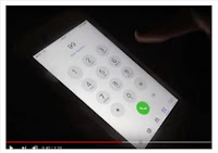
Frame 3- Lighting
Frame 3 shows Stacey dialling 999. This shot conforms to the common convention of low key lighting in thriller films. We decided to use low key lighting as it creates a dark and mysterious atmosphere which fits in well with the storyline of our film. Also, the brightness of the phone screen against the dark background is contrasting which helps the shot stand out. We took inspiration from the film Prisoners as this thriller film features a mid shot of a car with its lights on at night, which therefore means there is a clear contrast making the shot memorable as it stands out. In many more of our shots, such as the car headlights switching on and the conversation between Stacey and Mrs Lane, we continued to use low key lighting to ensure the sense of darkness runs throughout the whole film trailer. Before filming these shots we took the time to arranged times to film them to ensure we received the correct lighting so they looked as effective as possible.
Frame 4- Setting
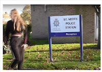 Some of the settings that feature throughout No More include the outside of St Neots police station, a park, St Neots Secondary School and Stacey's bedroom. All of these settings are conventional except the school. We decided to follow these conventions as they help to establish the genre. Also, these settings appear in the everyday lives of our target audience which in some ways makes our film relatable to them. For example, the bedroom setting emphasises the fact that the characters are just 'normal' citizens, which makes the audience emphasise with the situation more as they understand that bad things can happen to anyone. The house setting has the same effect as the bedroom setting an appears in many thriller films such as the Purge and Gone Girl. The school setting in No More is becoming ever more conventional. This is because in thriller films, typically the characters are older and of adult age however, we wanted our antagonist to be younger to show how times and thriller films are changing. For example, more media products within the thriller genre now are using younger characters such as 13 Reasons Why. The police station is the most conventional setting in our film trailer and appear in several thriller films such as Gone Girl, Prisoners and The Perfect Guy. They are conventional as police and police stations connote fear and danger which are emotions that appear in most thriller trailers.
 Deciding on the font for our title was quite a long process due to the amount of options we had. Eventually we decided on 'Franklin Gothic Heavy'. We took inspiration from the 'Purge' title as it is very simple but effective; just how we wanted ours to be. We chose a sans serif font as it connotes seriousness which is related to the plot of our film. This is another common convention in thriller films that we decided to conform to.
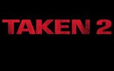 The colours we decided on in the No More title are red, white and black. The background is black, the 'No' is in white and the 'More' is in red. The colours black and red connote danger and fear and which are all emotions that feature in the thriller genre. White, on the other hand, connotes purity and innocence which contrasts against the connotations of the black and red. This creates a sense of uncertainty to the audience, which is another convention in thriller films. We took inspiration from the 'Taken 2' film title when deciding on the colours we would use, however we wanted to feature more colours so added in white.
Frame 1- Storyline
Frame 1 is an image of the detective board that Stacey got her hands on whilst taking the case into her own hands. This is one of the ways in my trailer that will show the audience that Stacey has decided to try and solve the case herself. The board and what features on it indicates to the audience that there are several suspects that need to be questioned about the murder of Zac, which is a common convention in the thriller genre. However, No More is also unconventional when it comes to storylines of thriller films as the antagonist does not feature. The antagonist does not make an appearance in my film as we wanted the mystery to be as enhanced as possible. The nature of the storyline of No More resulted in my trailer being left on a cliff hanger- another convention we conformed to in the thriller genre. We did this by the final shot being of someone picking the flowers up from Zac's grave and picking the petals off. It is unclear to the audience who this person is which increases the mystery and uncertainty, making the want to see the whole film.
Frame 2- Props
For frame 2 I have used a mid shot of Mrs Lane drinking a glass of vodka and the alcohol bottle placed on the table in front of her. Alcohol is a common convention in the thriller genre as it is used as a coping mechanism for characters that are struggling. In our trailer it is Mrs Lane, Zac's mother, that is struggling so she turns to alcohol as a way to help her feel less pain. In the thriller film, Girl On The Train, there is a similar shot of the protagonist with an alcohol bottle in her hand, suggesting that she is using alcohol as a way of numbing her pain and depression. We decided to feature this convention in our trailer as it highlights the pain and emotion that the characters are feeling.

Frame 3- Lighting
Frame 3 shows Stacey dialling 999. This shot conforms to the common convention of low key lighting in thriller films. We decided to use low key lighting as it creates a dark and mysterious atmosphere which fits in well with the storyline of our film. Also, the brightness of the phone screen against the dark background is contrasting which helps the shot stand out. We took inspiration from the film Prisoners as this thriller film features a mid shot of a car with its lights on at night, which therefore means there is a clear contrast making the shot memorable as it stands out. In many more of our shots, such as the car headlights switching on and the conversation between Stacey and Mrs Lane, we continued to use low key lighting to ensure the sense of darkness runs throughout the whole film trailer. Before filming these shots we took the time to arranged times to film them to ensure we received the correct lighting so they looked as effective as possible.
 Some of the settings that feature throughout No More include the outside of St Neots police station, a park, St Neots Secondary School and Stacey's bedroom. All of these settings are conventional except the school. We decided to follow these conventions as they help to establish the genre. Also, these settings appear in the everyday lives of our target audience which in some ways makes our film relatable to them. For example, the bedroom setting emphasises the fact that the characters are just 'normal' citizens, which makes the audience emphasise with the situation more as they understand that bad things can happen to anyone. The house setting has the same effect as the bedroom setting an appears in many thriller films such as the Purge and Gone Girl. The school setting in No More is becoming ever more conventional. This is because in thriller films, typically the characters are older and of adult age however, we wanted our antagonist to be younger to show how times and thriller films are changing. For example, more media products within the thriller genre now are using younger characters such as 13 Reasons Why. The police station is the most conventional setting in our film trailer and appear in several thriller films such as Gone Girl, Prisoners and The Perfect Guy. They are conventional as police and police stations connote fear and danger which are emotions that appear in most thriller trailers.
Frame 5- Title
Frame 5 of my 9 frame analysis shows our title and how it is presented in our trailer. No More was not the original name of our film however myself and Abbie decided that it fits much better with the genre and story line as it gives the audience a brief insight into our trailer without giving too much away, still leaving ambiguity and uncertainty about what actually happens in our trailer and film.
One way in which our title uses conventions of other thriller film titles is because it is only two words. Most thriller film titles consist of one or two word titles such as 'Gone Girl', 'Taken' and 'Prisoners'. We decided to follow this convention as the shorter names are generally more effective because they are easier to remember. This means that our film name will be memorable to our target audience which will result in them watching the whole film.
 Deciding on the font for our title was quite a long process due to the amount of options we had. Eventually we decided on 'Franklin Gothic Heavy'. We took inspiration from the 'Purge' title as it is very simple but effective; just how we wanted ours to be. We chose a sans serif font as it connotes seriousness which is related to the plot of our film. This is another common convention in thriller films that we decided to conform to.
 The colours we decided on in the No More title are red, white and black. The background is black, the 'No' is in white and the 'More' is in red. The colours black and red connote danger and fear and which are all emotions that feature in the thriller genre. White, on the other hand, connotes purity and innocence which contrasts against the connotations of the black and red. This creates a sense of uncertainty to the audience, which is another convention in thriller films. We took inspiration from the 'Taken 2' film title when deciding on the colours we would use, however we wanted to feature more colours so added in white.
Frame 6- Film Poster
Frame 6 is an image of the bottom of my film poster. I chose this part of my poster as it follows several conventions of thriller film posters. For example, the institutional information is a common convention on film posters which I decided to follow as it gives the audience more information about the behind the scenes activities, making the audience more interested and leaving them wanting to watch the whole film. Other conventions that features on my film poster is the release date and age certificate. I decided to include these on my poster as it reminds the audience of our film. For example, the release date reminds them when the film is coming out and the age certificate reminds them of the target audience for our film. It also indicates that some things included in our film are too inappropriate for anyone younger than the age of 15 which will make our target audience want to watch No More as people in this age bracket are interested in exciting, thrilling and intense films. Another conventional feature on my film poster, which is not shown in the image, is the 5 star rating that I included. This shows the audience that our film is of the best quality and will make them want to watch it, which is why I decided to feature it on my poster.
Frame 7- Special Effects
We used several different special effects during our trailer. Some of which included the contrast effect, the blur effect and the black and white effect. We decided to us many special effects as it
connotes that things are very distorted and confused. The special effect shown in frame 7 is the contrast effect. We added in special effects to show the change in the atmosphere of the film and to show that bad things can happen to anyone at any time. Many of the special effects we used in our film trailer are conventional such as the blur and black and white effect as they both appear I films such as Before I Go To Sleep and Girl On The Train, however, the contrast effect was unconventional and appeared in very few thriller films. We also used video transitions to make the shots fade in nicely. The transitions we used most were fade to black and fade to white. These transitions appeared mostly at the start of No More, before the mood dramatically changed. We featured them at the start of the trailer so that each shot transitioned smoothly into the next. As the mood of our film changed, the less transitions we used. This was to connote chaos and mystery which are both conventional themes that run throughout thriller films.
Frame 8- Introduction of Characters
Throughout our trailer only 4 characters are introduced, one of which is the main character. This is challenging conventions of thriller films and trailers as typically several characters are featured and introduced in this particular media product. We decided on using a minimal amount of characters so that the audience are able to focus on the plot more. Also, by using fewer characters, the audience would be able to invest more in the other characters. This means that the audience would engage more in Stacey's, the antagonist, journey which will make them feel more involved and result in them watching the whole of No More.
In the No More trailer the protagonist is never introduced to the audience. We decided to do this to create a sense of ambiguity and mystery. In this media product, the protagonist is not conventionally introduced at all, or if they are they are featured in a way which hides their identity, for example by wearing a black hoodie or some sort of mask. In the thriller film Now You See Me, the protagonist is not introduced until the end of the film and is portrayed by mid shots from behind in a black hooded jumper until this point.
Zach Lane and Stacey are introduced together at the start of No More. The are portrayed as having a very good friendship as in the mid shot they are laughing and chatting together. This allows us to create a strong contrast between the friendship and the horror of the death of Zach Lane.
Frame 9- Magazine Front Cover
Frame 9 shows a section of my magazine front cover. This section of my magazine cover conforms to many conventions of film magazine covers. It shows the title of our film which is displayed in the same font as in our trailer and on my film poster. This is to show synergy and allows the audience to link all my of media products together, which is conventional in real media texts. Another way I used synergy was by the colour scheme I had chosen. I used red, white and black on my magazine front cover as very similar colouring appears throughout my film poster and trailer thus reminding the audience of my media products. My magazine cover also includes a barcode, issue number, price and date. These things are all also conventional as they are necessary on all magazines. One part of my magazine that is unconventional is that the word 'Exclusive' is larger than the film name. Stereotypically the film name is displayed larger than any other words on the cover, except the magazine name. I decided against this as the word 'Exclusive' is a very catchy buzz word. This will attract the reader and audience more as this will associate my media texts with high quality products.
Friday, 23 March 2018
Evaluation 2
How effective is the combination of my main and ancillary products?
I used synergy across my 3 media texts to help the audience link all my products together. This will help to attract the audience to the film because they will recognise elements such as the characters, fonts and the similar colours, reminding them of the film and making them want to see it.
I also tried to follow the conventions of the psychological thriller genre as well as film trailers themselves. I did this because these features would be instantly recognisable to our target audience of young adults aged between 15 and 25. We decided to make these ages our target audience as our trailer contains complex and emotive features- things that these ages are interested in.
One way in which I've used synergy throughout my media texts is with the font. The font used in our texts is called Franklin Gothic Heavy. We agreed on this font as it very simple and bold which is exactly the look we were going for. The font appears several times in the No More trailer on the titles and inter-titles throughout and credits at the end. On my film poster, the 'No More' text is written in Franklin Gothic Heavy. On my film poster, a lot of the text is written in this font including the characters names and release date. I also decided to use similar colouring in all my media texts as like the font it helps link them all together. I chose the colours white and a deep red. I chose these colours as white connotes innocence and purity whereas re connotes danger. Therefore, connotations of these colours are contrasting which increases the sense of uncertainty that the audience feels as they are unsure what has actually happened. Using the same font and colours throughout my texts is a good technique as it makes the film recognisable to the audience. It also makes my products look all the more professional as they all link together.
Film Poster Magazine Front Cover
No More Trailer
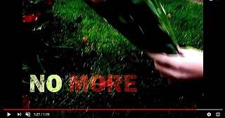 Another way in which I have used synergy is by not featuring the antagonist. In all 3 of my media texts I decided to not feature the antagonist. The only shots that remotely feature the antagonist are the shots at the end of the trailer where the audience see the killer taking the flowers from the grave and picking the petals off them. I decided on this because it creates more mystery and uncertainty. Leaving the antagonist out will attract the target audience of the trailer further as it adds complexity and excitement which is appealing to this group of people.
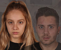 I also used stereotypical conventions to attract my target audience. One convention I followed was having the main characters featured on my magazine front cover and film poster. I featured both Zac and Stacey on the front of my film poster but only used an image of Zac on my magazine front cover. I decided to use both the characters on my film poster as they both have very different facial expressions. Stacey's expression does not give much away however, it is obvious that she looks serious. This makes the audience question why she looks this way, connoting uncertainty and therefore leaving them intrigued. Zac's facial expression is different from Stacey's as he looks distressed and fearful. Also, these images are front on so directly address the audience. This direct mode of address creates the impression that the characters are asking the audience for help. This will make the audience want to see the film as they will feel more involved. The image on my magazine front cover is of Zac. I chose to only feature him on my magazine front cover as the image I used is very powerful. The image shows Zac with his head in his hand looking extremely vulnerable and emotional. The fact that he is looking away from the a
 udience connotes that he is scared of something or someone as he is not making eye contact or using a direct mode of address. This will make the audience wonder what he is so fearful of, resulting in them watching the whole film.
I used synergy across my 3 media texts to help the audience link all my products together. This will help to attract the audience to the film because they will recognise elements such as the characters, fonts and the similar colours, reminding them of the film and making them want to see it.
I also tried to follow the conventions of the psychological thriller genre as well as film trailers themselves. I did this because these features would be instantly recognisable to our target audience of young adults aged between 15 and 25. We decided to make these ages our target audience as our trailer contains complex and emotive features- things that these ages are interested in.
One way in which I've used synergy throughout my media texts is with the font. The font used in our texts is called Franklin Gothic Heavy. We agreed on this font as it very simple and bold which is exactly the look we were going for. The font appears several times in the No More trailer on the titles and inter-titles throughout and credits at the end. On my film poster, the 'No More' text is written in Franklin Gothic Heavy. On my film poster, a lot of the text is written in this font including the characters names and release date. I also decided to use similar colouring in all my media texts as like the font it helps link them all together. I chose the colours white and a deep red. I chose these colours as white connotes innocence and purity whereas re connotes danger. Therefore, connotations of these colours are contrasting which increases the sense of uncertainty that the audience feels as they are unsure what has actually happened. Using the same font and colours throughout my texts is a good technique as it makes the film recognisable to the audience. It also makes my products look all the more professional as they all link together.
Film Poster Magazine Front Cover
No More Trailer
 Another way in which I have used synergy is by not featuring the antagonist. In all 3 of my media texts I decided to not feature the antagonist. The only shots that remotely feature the antagonist are the shots at the end of the trailer where the audience see the killer taking the flowers from the grave and picking the petals off them. I decided on this because it creates more mystery and uncertainty. Leaving the antagonist out will attract the target audience of the trailer further as it adds complexity and excitement which is appealing to this group of people.
Another way in which I synergised my 3 media products is by featuring information about the characters, cast, crew, etc. This institutional information is conventional in thriller trailers and film posters however not on magazine front covers. I decided to feature it on my poster and in my trailer as it provides the audience with more information. As well as this institutional information, I included a 5 star rating on my film poster. This instantly attracts the audience as it tells them No More is a highly rated film. Another way in which my poster shows that my film is of high quality is the quotes. I included quotes such as 'Spine tingling' and 'Thrill seeking' from well know sources- enhancing the fact that my film is of the best quality possible.
 I also used stereotypical conventions to attract my target audience. One convention I followed was having the main characters featured on my magazine front cover and film poster. I featured both Zac and Stacey on the front of my film poster but only used an image of Zac on my magazine front cover. I decided to use both the characters on my film poster as they both have very different facial expressions. Stacey's expression does not give much away however, it is obvious that she looks serious. This makes the audience question why she looks this way, connoting uncertainty and therefore leaving them intrigued. Zac's facial expression is different from Stacey's as he looks distressed and fearful. Also, these images are front on so directly address the audience. This direct mode of address creates the impression that the characters are asking the audience for help. This will make the audience want to see the film as they will feel more involved. The image on my magazine front cover is of Zac. I chose to only feature him on my magazine front cover as the image I used is very powerful. The image shows Zac with his head in his hand looking extremely vulnerable and emotional. The fact that he is looking away from the a
 udience connotes that he is scared of something or someone as he is not making eye contact or using a direct mode of address. This will make the audience wonder what he is so fearful of, resulting in them watching the whole film.
Another convention I have followed is the editing technique in my film trailer. There are distinctive editing techniques in thriller trailers which are constructed to create effect. For example, I used fast paced editing towards the end of No More, similar to other thriller trailers such as Before I Go To Sleep and The Perfect Guy, to create a sense of chaos and confusion. This appeals to the target audience as they want to try understand the chaotic uncertainty, meaning they will watch the whole film so they can make sense of it all. Another editing technique used in my trailer and others is the use of black and white shots. In thriller film trailers, such as Girl On The Train, the black and white is used to indicate a flashback. However, in my trailer I decided to feature it on a handful of shots that were not flashbacks. I decided that I liked the idea of not using any flashbacks as my trailer would remain completely ambiguous to the audience and they uncertainty of what actually happened would be enhanced. This will make the audience want to see my film even more, meaning they decide to watch the whole thing.
In conclusion, I believe I have successfully created 3 media texts that are appealing to my target audience. I have synergised my products to ensure that my film is recognisable to the audience and also tried to follow stereotypical conventions of the genre and media text to make my main product appeal to the audience. I believe that my target audience would have an interest in all 3 of my constructed media texts as well as the No More Instagram page I created- which has also been synergised.
Tuesday, 20 March 2018
Evalutation 3
What have you learnt from your audience feedback?
Film Trailer Feedback
Social Media Feedback- One way in which we were able to get feedback from our audience is through the means of Instagram. Instagram was a good way to get feedback on our trailer as it has over 800 millions users which means we could get a wide range of audience feedback.
Above shows some of the comments we received on our Instagram post. Overall, we were pleased with the comments that had been made as they were honest with both positive and negative comments being given.
Verbal Feedback- We received a lot of verbal feedback on our film trailer from many different people, some of which include friends, family teachers and class mates. I made a note of this verbal feedback given on the notes app on my phone. This is so we did not forget the changes and improvements we needed to make. Below shows some of the verbal feedback we received.
Positive
Changes- We decided to make some changes as result of the audience feedback that we received to try and make our film as good as it could possibly be. Some changes include...
Film Poster Feedback
Like our film trailer, I had a lot of feedback on my film poster too. This helped me a lot during the making of my poster as it allowed me to make the changes and improvements needed to.
Positive Feedback
Film Magazine Front Cover
Most of the feedback I received about my magazine front cover was positive so I only had to make marginal changes to it when I received the negative feedback.
Positive Feedback
Film Trailer Feedback
Social Media Feedback- One way in which we were able to get feedback from our audience is through the means of Instagram. Instagram was a good way to get feedback on our trailer as it has over 800 millions users which means we could get a wide range of audience feedback.
Above shows some of the comments we received on our Instagram post. Overall, we were pleased with the comments that had been made as they were honest with both positive and negative comments being given.
Verbal Feedback- We received a lot of verbal feedback on our film trailer from many different people, some of which include friends, family teachers and class mates. I made a note of this verbal feedback given on the notes app on my phone. This is so we did not forget the changes and improvements we needed to make. Below shows some of the verbal feedback we received.
Positive
- Good range of shots
- Good use of camera angles
- Story line fits in well with the genre
- Good start to editing
- Need to include more video effects
- Improve sound
- Re order shots around to create a more chaotic feel
- Faster paced editing needed at the end to build up the tension
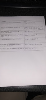
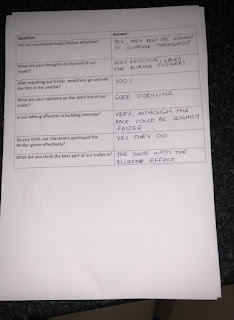
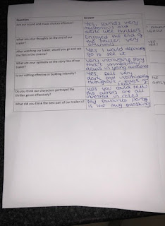
Questionnaire Feedback- Myself, Abbie and Niall created a short questionnaire about our thriller film trailer which we got friends and class mates to fill out. We told the group of people filling out our questionnaires to leave them anonymous. This is so we could receive truthful feedback as we thought if people put their names on the questionnaires they might hesitate to give negative feedback as we would know who gave it. We received a wide range of feedback which is seen in the images below.


Changes- We decided to make some changes as result of the audience feedback that we received to try and make our film as good as it could possibly be. Some changes include...
- Lighting- A common convention in thriller films is low key lighting as it creates a sense of fear in the audience. We therefore tried to incorporate it constantly throughout our trailer. However, it was hard to use this element of mise en scene throughout the whole trailer. This is because some of them were so dark they were unclear to the audience. For example, the shots of Detective Marshall trying to solve the case were too dark. At first we thought that we would have to re film all of these shots with better lighting however, we managed to find a tool on Adobe Photoshop which lifted the lighting slightly, making the image clearer. The image below shows one of the shots of Detective Marshall after we changed the lighting.
- Effects- Many effects appear throughout thriller film trailers to help create a sense of mystery. One criticism we received a few times was that there was not enough effects in our trailer. In our first draft we included effects such as black and white and rewind. We then added in slow motion and the blur effect which appear in the thriller film trailer, Before I Go To Sleep.
Like our film trailer, I had a lot of feedback on my film poster too. This helped me a lot during the making of my poster as it allowed me to make the changes and improvements needed to.
Positive Feedback
- Good image manipulation
- Good use of colour
- Effective background
Negative Feedback
- The top of the poster looked too empty
- Images could be bigger
Changes
This is what the top of my film poster was like before I changed it. My teachers and class mates all had the same view that the top looked too sparse and could do with re arranging. I definitely agreed with these comments once they had been made and made some slight changes. Below shows the adjustments I made.
This image is how I changed the top of my film poster to improve it. I added in quotes from well known newspapers and magazines to make our film appeal to the audience. I also moved the title, tag line and Daily Mail rating to the centre of the poster to make it stand out even more.
- Another change I made was making the image of Stacey larger. This is because a piece of negative feedback I received was that the images were slightly too small. I decided to make the image of Stacey bigger and leave the mage of Zac as it was. This is because Stacey is the protagonist so it makes sense for her image to be larger than Zac's. I also decided to reduce the opacity of Zac's image. This means that his image is slightly more see through. I did this because Zac is murdered in our trailer so only appeared in the very start, so therefore I thought it made sense that his image was smaller and more transparent than Stacey's.
Final Film Poster
Film Magazine Front Cover
Most of the feedback I received about my magazine front cover was positive so I only had to make marginal changes to it when I received the negative feedback.
Positive Feedback
- Good colour scheme
- Good layout
- Liked the 'Free poster inside'- entices the reader to buy it
Negative Feedback
- Looks too much like a fashion magazine- needs a cover line
Changes
- My teachers and peers believed that my magazine cover looked a little bit like a fashion magazine cover, which is not the look I was going for. I made changes to the top of my magazine cover to ensure that it looked like a film magazine cover. My first step was moving the magazine name, 'Rating', down. This automatically helped take away from the fashion magazine feel. However, it then looked too empty so I decided to add a cover line which made the whole thing come together as a film magazine front cover.
Final Film Magazine Front Cover
Sunday, 18 March 2018
Evaluation 4
How did you use new media technologies in the construction, research, planning and evaluation stages?
iPhone- Our iPhone's were a large part of the construction, research and planning of our film trailer. It was used for many different things in the process of making our trailer. One thing it helped us with was communication. This is because our iPhone's have the latest technology which allowed us to use and download applications such as Facebook Messenger. Myself, Abbie and Niall used Facebook Messenger as a way to communicate with each other outside of school to arrange filming, discuss ideas etc. Another reason why we decided to use our iPhone's is because they are of good quality. This meant that we could take pictures, which would be of high quality, which we have used as evidence of our filming. The good camera quality also allowed us to make vlogs during the construction and planning of our trailer. As well as the above, another way our phones helped us is the Notes app already installed on iPhones. This allowed us to keep track of things that we still needed to do and things that we needed to improve. With the technology on our phones being so advanced, we were able to access the internet which allowed us to use things such as YouTube, Blogger, etc which made our research and planning much easier.
 Blogger- Blogger has been a very easy and efficient way of displaying my coursework. It has allowed me to display all of what I needed to display with no trouble at all. I managed to access the website through many different devices such as my laptop, home computer, school computer and mobile phone which made it very easy to add new posts in present time. Also the different 'Publish' and 'Save' buttons helped me very much when dong my research, planning and evaluations as it allowed my to save unfinished work without the post being visible on my blog until the post was completely finished and I clicked the 'Publish' button. Having said this, I am also able to change a blog post even if it has been published. This means that we can make changes to any post very easily.
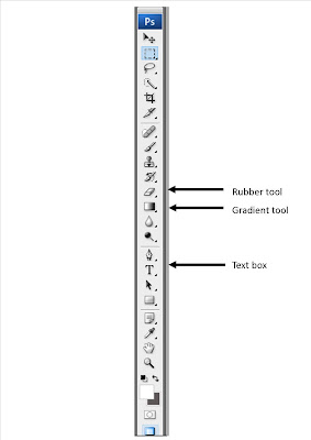 Adobe Photoshop- Photoshop was a vital part in the construction of my media texts. This is because I used this software to create my film poster, magazine front cover, production company logo and the credits that appear at the end of the No More trailer. To start with, I found Photoshop quite difficult to use as I had never had experience using it before. However, I managed to get my head around it quite quickly as I had the help of my class mates, teachers and the internet. One of the tools I used on Photoshop is the 'T' tool. This allowed me to add in text wherever I wanted to. I would click on the 'T', draw a textbox and then was able to type whatever I wanted. After I had typed the text I was able to change the colour, font, size and positioning according to my vision. The font I chose was 'Franklin Gothic Heavy' as I wanted to create synergy through all of my media texts. Another tool I used on Photoshop was the gradient tool. I used this tool when I was making my magazine front cover. I used this effect on the background as I wanted it to be simple so it didn't draw attention away from the main image however, wanted it to be more interesting than just having one colour. The gradient tool was a perfect way to ensure this vision was achieved. I experimented with a range of colours for the gradient background including blue, white, black and red but my favourite by far was the black and grey, which are the colours I decided on using. Another of the many tools I used on Photoshop was the rubber. I used this to get rid of the original background around the main image to just leave the backgrounds I had created. This took me a while as I had to make sure that I rubbed out the background perfectly to leave the outline of the main image as neat as possible. I changed the rubber to a smaller size and reduced the hardness of the rubber as I got closer to the edges of the image to ensure the image outlines were tidy.
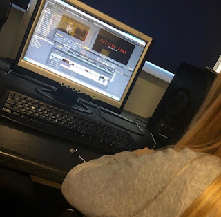 Adobe Premiere Pro- Adobe Premiere Pro is the editing software that we used to construct our trailer. Unlike Photoshop, I had already had a reasonable amount of experience using this as it is the editing software we used last year for our AS piece. Having said this, it was more complicated than last year as we wanted to expand our editing knowledge so had to spend more time experimenting. The software was very easy to use and allowed us to cut, crop, delete, duplicate and re watch our footage where we wanted without a struggle. Also, this software provided us with several video effects and video transitions. We used these to make our thriller trailer follow conventions of other thriller trailers. Some of these effects include the blur effect, black and white, rewind, dip to black, dip to white and the contrast effect. Premiere Pro also enabled us to add in audio as well as video footage. We were able to add in our music choices and the voice over where we wanted them. We added the sound according to how it fit the placement of our video footage. If we didn't like how it fit then we were able to delete it very easily and put in a different place that fit in better.
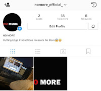
Social Media- As I was part of a group during the construction of my thriller trailer, communication between all group members was crucial. Social media allowed us to communicate with each other. One form of social media we used for communication was Facebook Messenger. It is a very simple app to use as all of the team members had lots of experience using this. Another form of social media we used was Instagram. We made an Instagram account so we could post pictures associated with our trailer and receive comments about our trailer to know what is good and what can be improved. Our Instagram page is managed by myself and Abbie, meaning we discuss what we think should be posted and then one of us will take it upon ourselves to upload the image. Social media was the perfect way to appeal to our target audience as the majority of the people who use social media are of the age we are trying to address.
YouTube- YouTube has been a very useful tool in this process. One reason why it has been useful is because it has allowed us to upload our drafts, final piece and vlogs. We then copied the link and posted the link on our blogs so that people are able to view them. Another way in which YouTube has helped me is with my research. I was able to search up other thriller film trailers which helped when I was analysing them as I was able to watch the trailers several times, pausing, playing and rewinding where I needed to. Analysing these trailers helped develop my thoughts and ideas further which also meant that I figured out the conventions I wanted to follow and the ones I wanted to challenge.
 Blogger- Blogger has been a very easy and efficient way of displaying my coursework. It has allowed me to display all of what I needed to display with no trouble at all. I managed to access the website through many different devices such as my laptop, home computer, school computer and mobile phone which made it very easy to add new posts in present time. Also the different 'Publish' and 'Save' buttons helped me very much when dong my research, planning and evaluations as it allowed my to save unfinished work without the post being visible on my blog until the post was completely finished and I clicked the 'Publish' button. Having said this, I am also able to change a blog post even if it has been published. This means that we can make changes to any post very easily.
 Adobe Photoshop- Photoshop was a vital part in the construction of my media texts. This is because I used this software to create my film poster, magazine front cover, production company logo and the credits that appear at the end of the No More trailer. To start with, I found Photoshop quite difficult to use as I had never had experience using it before. However, I managed to get my head around it quite quickly as I had the help of my class mates, teachers and the internet. One of the tools I used on Photoshop is the 'T' tool. This allowed me to add in text wherever I wanted to. I would click on the 'T', draw a textbox and then was able to type whatever I wanted. After I had typed the text I was able to change the colour, font, size and positioning according to my vision. The font I chose was 'Franklin Gothic Heavy' as I wanted to create synergy through all of my media texts. Another tool I used on Photoshop was the gradient tool. I used this tool when I was making my magazine front cover. I used this effect on the background as I wanted it to be simple so it didn't draw attention away from the main image however, wanted it to be more interesting than just having one colour. The gradient tool was a perfect way to ensure this vision was achieved. I experimented with a range of colours for the gradient background including blue, white, black and red but my favourite by far was the black and grey, which are the colours I decided on using. Another of the many tools I used on Photoshop was the rubber. I used this to get rid of the original background around the main image to just leave the backgrounds I had created. This took me a while as I had to make sure that I rubbed out the background perfectly to leave the outline of the main image as neat as possible. I changed the rubber to a smaller size and reduced the hardness of the rubber as I got closer to the edges of the image to ensure the image outlines were tidy.
  Adobe Premiere Pro- Adobe Premiere Pro is the editing software that we used to construct our trailer. Unlike Photoshop, I had already had a reasonable amount of experience using this as it is the editing software we used last year for our AS piece. Having said this, it was more complicated than last year as we wanted to expand our editing knowledge so had to spend more time experimenting. The software was very easy to use and allowed us to cut, crop, delete, duplicate and re watch our footage where we wanted without a struggle. Also, this software provided us with several video effects and video transitions. We used these to make our thriller trailer follow conventions of other thriller trailers. Some of these effects include the blur effect, black and white, rewind, dip to black, dip to white and the contrast effect. Premiere Pro also enabled us to add in audio as well as video footage. We were able to add in our music choices and the voice over where we wanted them. We added the sound according to how it fit the placement of our video footage. If we didn't like how it fit then we were able to delete it very easily and put in a different place that fit in better.
Social Media- As I was part of a group during the construction of my thriller trailer, communication between all group members was crucial. Social media allowed us to communicate with each other. One form of social media we used for communication was Facebook Messenger. It is a very simple app to use as all of the team members had lots of experience using this. Another form of social media we used was Instagram. We made an Instagram account so we could post pictures associated with our trailer and receive comments about our trailer to know what is good and what can be improved. Our Instagram page is managed by myself and Abbie, meaning we discuss what we think should be posted and then one of us will take it upon ourselves to upload the image. Social media was the perfect way to appeal to our target audience as the majority of the people who use social media are of the age we are trying to address.


YouTube- YouTube has been a very useful tool in this process. One reason why it has been useful is because it has allowed us to upload our drafts, final piece and vlogs. We then copied the link and posted the link on our blogs so that people are able to view them. Another way in which YouTube has helped me is with my research. I was able to search up other thriller film trailers which helped when I was analysing them as I was able to watch the trailers several times, pausing, playing and rewinding where I needed to. Analysing these trailers helped develop my thoughts and ideas further which also meant that I figured out the conventions I wanted to follow and the ones I wanted to challenge.
Friday, 16 March 2018
Changes
Another change we decided to make was the script. We believed that our trailer didn't have enough speech in it. Our peers and teachers also thought this so for the second draft we decided to add in more dialogue. The up to date script is seen below.
Stacey- That is so funny
Zac- That is so funny
Stacey- Zac?
Zac- I need to go
News reader (voice over)- Zachary Lane, aged 17, was found dead in St Neots School toilets yesterday at 13.24. The investigation is under weigh and the police are doing all they can to ensure they find out what happened
Detective Marshall- The case is closed, it was suicide
Stacey- I will find out who did this
Mrs Lane- I just can't take this anymore
Sunday, 11 March 2018
No More- second draft and improvements
https://youtu.be/imuksQQIwlw
We tried to change as many of the criticisms that we got from our first draft for our second draft. Some of the things we changed were...
We tried to change as many of the criticisms that we got from our first draft for our second draft. Some of the things we changed were...
- Adding in more effects and transitions
- Adding in more footage
- Adding in more dialogue- including the voice over
- Re filming the first scene
Some further improvements that we have been told to make are...
- Re order the shots- this will help create a sense of chaos and uncertainty which is conventional in thriller films such as Gone Girl and Girl On The Train. For example, the trailer makes you think the film will end very differently to how the actually do end.
- Faster paced editing is needed at the end to build up the drama and create suspense.
Subscribe to:
Comments (Atom)
No More- Final Thriller Film Trailer
https://youtu.be/aB25ei59j-0
-
https://www.youtube.com/watch?v=cIfyzhK947M This vlog of myself and Abbie is during the filming of Stacey waking up from a nightmare. We a...
-
What have you learnt from your audience feedback? Film Trailer Feedback Social Media Feedback- One way in which we were able to get fee...
-
How effective is the combination of my main and ancillary products? I used synergy across my 3 media texts to help the audience link all m...


