I used synergy across my 3 media texts to help the audience link all my products together. This will help to attract the audience to the film because they will recognise elements such as the characters, fonts and the similar colours, reminding them of the film and making them want to see it.
I also tried to follow the conventions of the psychological thriller genre as well as film trailers themselves. I did this because these features would be instantly recognisable to our target audience of young adults aged between 15 and 25. We decided to make these ages our target audience as our trailer contains complex and emotive features- things that these ages are interested in.
One way in which I've used synergy throughout my media texts is with the font. The font used in our texts is called Franklin Gothic Heavy. We agreed on this font as it very simple and bold which is exactly the look we were going for. The font appears several times in the No More trailer on the titles and inter-titles throughout and credits at the end. On my film poster, the 'No More' text is written in Franklin Gothic Heavy. On my film poster, a lot of the text is written in this font including the characters names and release date. I also decided to use similar colouring in all my media texts as like the font it helps link them all together. I chose the colours white and a deep red. I chose these colours as white connotes innocence and purity whereas re connotes danger. Therefore, connotations of these colours are contrasting which increases the sense of uncertainty that the audience feels as they are unsure what has actually happened. Using the same font and colours throughout my texts is a good technique as it makes the film recognisable to the audience. It also makes my products look all the more professional as they all link together.
Film Poster Magazine Front Cover


No More Trailer


 Another way in which I have used synergy is by not featuring the antagonist. In all 3 of my media texts I decided to not feature the antagonist. The only shots that remotely feature the antagonist are the shots at the end of the trailer where the audience see the killer taking the flowers from the grave and picking the petals off them. I decided on this because it creates more mystery and uncertainty. Leaving the antagonist out will attract the target audience of the trailer further as it adds complexity and excitement which is appealing to this group of people.
Another way in which I synergised my 3 media products is by featuring information about the characters, cast, crew, etc. This institutional information is conventional in thriller trailers and film posters however not on magazine front covers. I decided to feature it on my poster and in my trailer as it provides the audience with more information. As well as this institutional information, I included a 5 star rating on my film poster. This instantly attracts the audience as it tells them No More is a highly rated film. Another way in which my poster shows that my film is of high quality is the quotes. I included quotes such as 'Spine tingling' and 'Thrill seeking' from well know sources- enhancing the fact that my film is of the best quality possible.
 I also used stereotypical conventions to attract my target audience. One convention I followed was having the main characters featured on my magazine front cover and film poster. I featured both Zac and Stacey on the front of my film poster but only used an image of Zac on my magazine front cover. I decided to use both the characters on my film poster as they both have very different facial expressions. Stacey's expression does not give much away however, it is obvious that she looks serious. This makes the audience question why she looks this way, connoting uncertainty and therefore leaving them intrigued. Zac's facial expression is different from Stacey's as he looks distressed and fearful. Also, these images are front on so directly address the audience. This direct mode of address creates the impression that the characters are asking the audience for help. This will make the audience want to see the film as they will feel more involved. The image on my magazine front cover is of Zac. I chose to only feature him on my magazine front cover as the image I used is very powerful. The image shows Zac with his head in his hand looking extremely vulnerable and emotional. The fact that he is looking away from the a
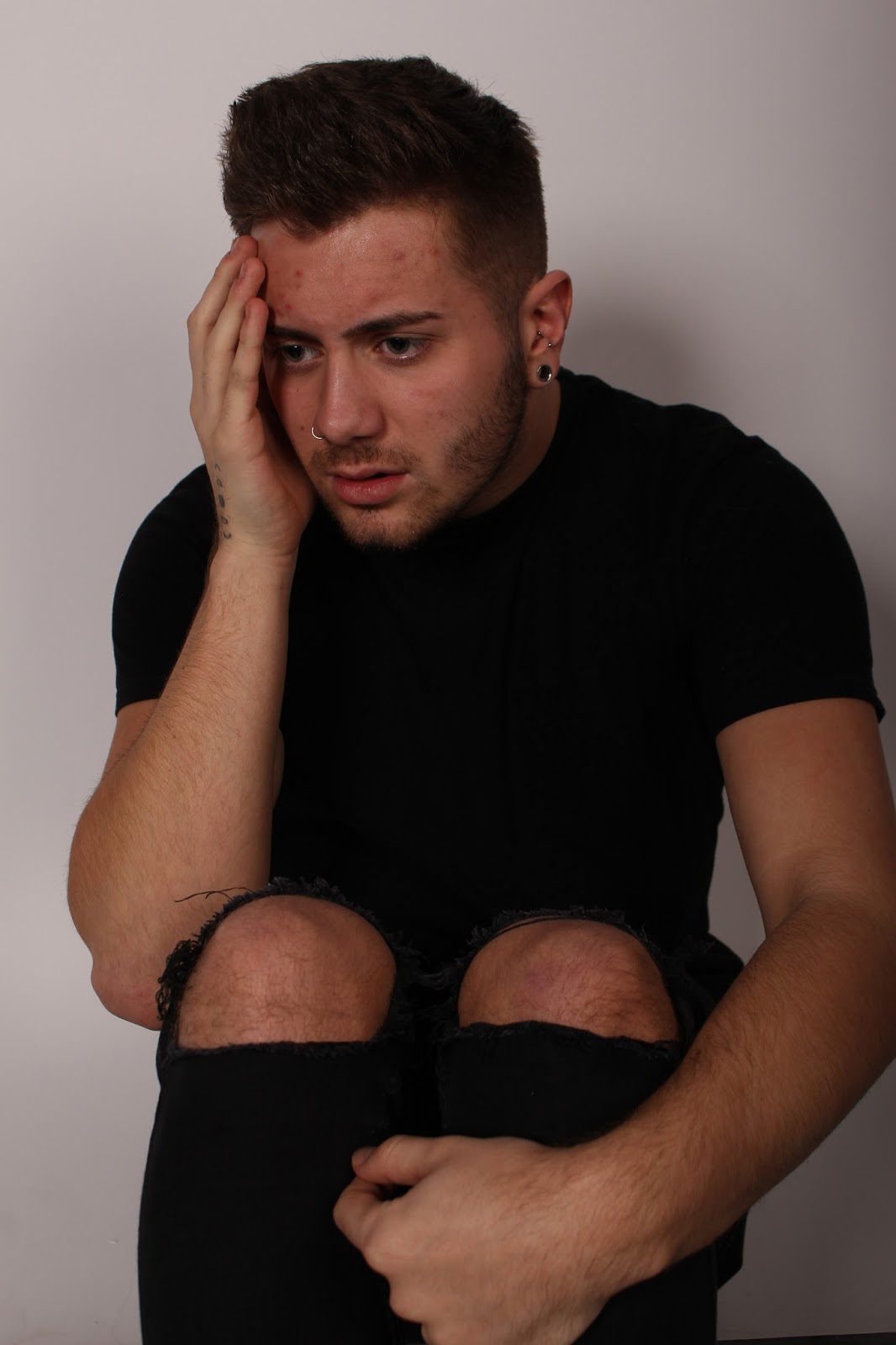 udience connotes that he is scared of something or someone as he is not making eye contact or using a direct mode of address. This will make the audience wonder what he is so fearful of, resulting in them watching the whole film.
Another convention I have followed is the editing technique in my film trailer. There are distinctive editing techniques in thriller trailers which are constructed to create effect. For example, I used fast paced editing towards the end of No More, similar to other thriller trailers such as Before I Go To Sleep and The Perfect Guy, to create a sense of chaos and confusion. This appeals to the target audience as they want to try understand the chaotic uncertainty, meaning they will watch the whole film so they can make sense of it all. Another editing technique used in my trailer and others is the use of black and white shots. In thriller film trailers, such as Girl On The Train, the black and white is used to indicate a flashback. However, in my trailer I decided to feature it on a handful of shots that were not flashbacks. I decided that I liked the idea of not using any flashbacks as my trailer would remain completely ambiguous to the audience and they uncertainty of what actually happened would be enhanced. This will make the audience want to see my film even more, meaning they decide to watch the whole thing.
In conclusion, I believe I have successfully created 3 media texts that are appealing to my target audience. I have synergised my products to ensure that my film is recognisable to the audience and also tried to follow stereotypical conventions of the genre and media text to make my main product appeal to the audience. I believe that my target audience would have an interest in all 3 of my constructed media texts as well as the No More Instagram page I created- which has also been synergised.